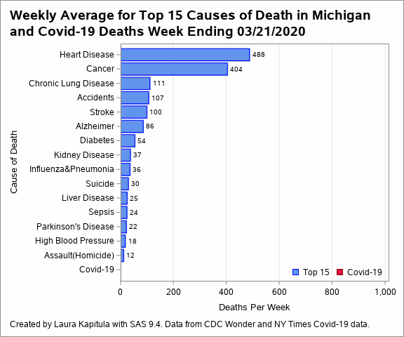
Graphics look at average weekly reported deaths by state for the top 15 causes compared to the weekly covid-19 deaths. Graphs were all created using SAS 9.4. Death counts are from the New York Times covid-19 GitHub repository and top 15 death counts are for 2018 and from the CDC. Average weekly counts are calculated as total for 2018 divided by 365 for the top 15 and the weekly covid counts are the reported deaths for each week, ending the week on Saturday.
A graphic created by Alex Estrella inspired the state level graphs.
Thank you to Alexander Schacht for the suggestion to add the lines to the graphics of weekly death counts.
Death dates might represent day a death is reported not date of death for some states.
Click here to look at another state.
Click here for svg version of the animated graphic in its own window